Your readers have short attention spans. There it is, all in black & white.
However, I’m sure that’s no big surprise to you, is it?
In fact, you probably browse the Internet at light speed, too, scanning titles and subheads, skipping to the bottoms of sales pages, and fast-forwarding through videos just so you can get to the next thing.
The same thing is true for your readers as well, and if you want to capture their attention just long enough to entice them to opt-in to your mailing list, then you have to keep that in mind.
**A Tip From Newspaper Publishers**
Have you ever noticed that everything you need to know about a news story is in the first paragraph?
Journalists are trained to answer all the questions — _who, what, where, when, why and how_ — in the first few sentences, just in case the story gets cut off when the paper goes to print.
However, in today’s online world, where column inches no longer matter, this type of story formatting isn’t quite so critical any more, but it’s still a useful tip to use when you’re writing an opt-in page.
**Think about it…**
If your readers are skanners (as most of us are) then making sure you include the most important information right at the top of the page is going to greatly improve your conversion rates.
For opt-in pages, that means putting the biggest benefits in your subject line, and following it up with two or three sentences that build on your headline.
That’s it. Now, be sure to keep it **short, sweet, and benefit driven**, and you’ll have greater success than you would with longer content.
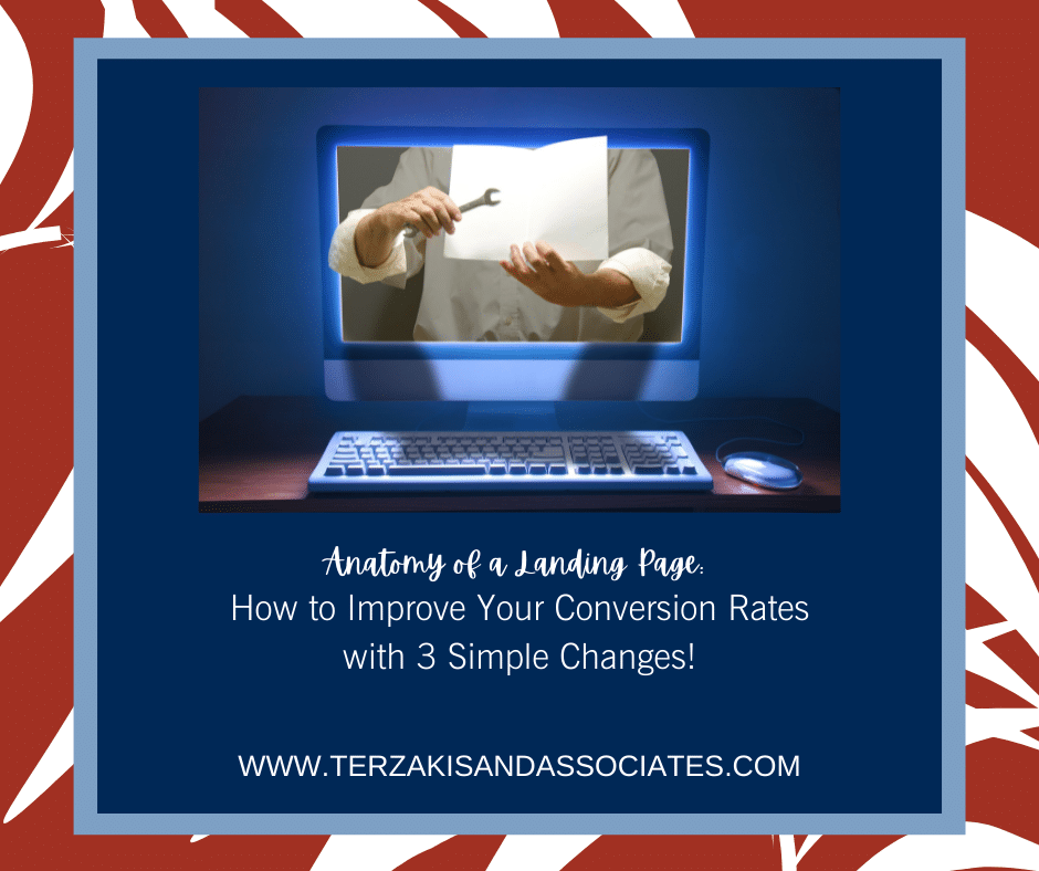
**Graphics Matter**
Whether your opt-in incentive is an eBook, a video, or even a simple checklist, having a graphic representation of your offer is an important component of your landing page, period! So, dont skimp.
Typically, you’ll create (or have created) a digital book or CD cover, awesome. You can easily outsource this, but be sure you follow these strategies:
• Bold fonts and short titles make your cover more readable.
• Use high-contrast colors for more visibility.
• Be true to your brand. Stick with colors and fonts your readers expect.
**Crafting a Compelling Call to Action**
While it seems as if you can expect readers to know what to do when they land on your opt-in page, it’s just not true. You have to invite them to take the next step.
Give them specific instructions and you’ll have higher conversion rates than if you just leave it to chance.
Your call to action(CTA) should tell a reader **exactly** what to do, like this:
• **Click here **to download
• **Enter your name and email** for instant access
Watch the text on your form buttons, too.
After all, “Subscribe” or “Sign Up” doesn’t exactly make you feel excited, does it? Consider using a phrase that matches your call to **action **instead, such as:
• **Get** the Checklist!
• **Send** the Video!
Take a look at your opt-in pages. Do they follow these strategies?
If not, consider making some incremental changes to your copy, your images, and your calls to action, then watch your results. You’ll more than likely see a boost in conversion rates if you do.